Green Era
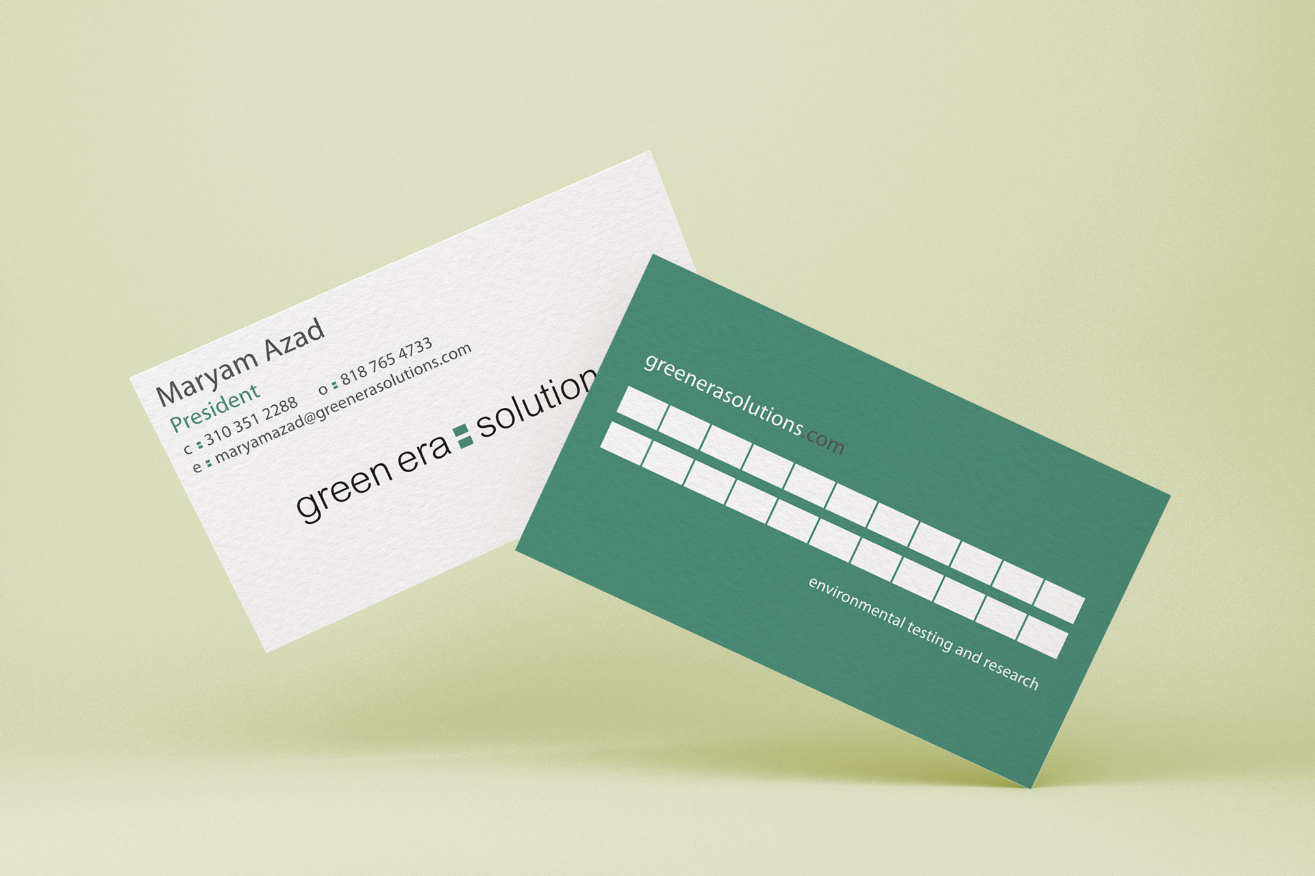
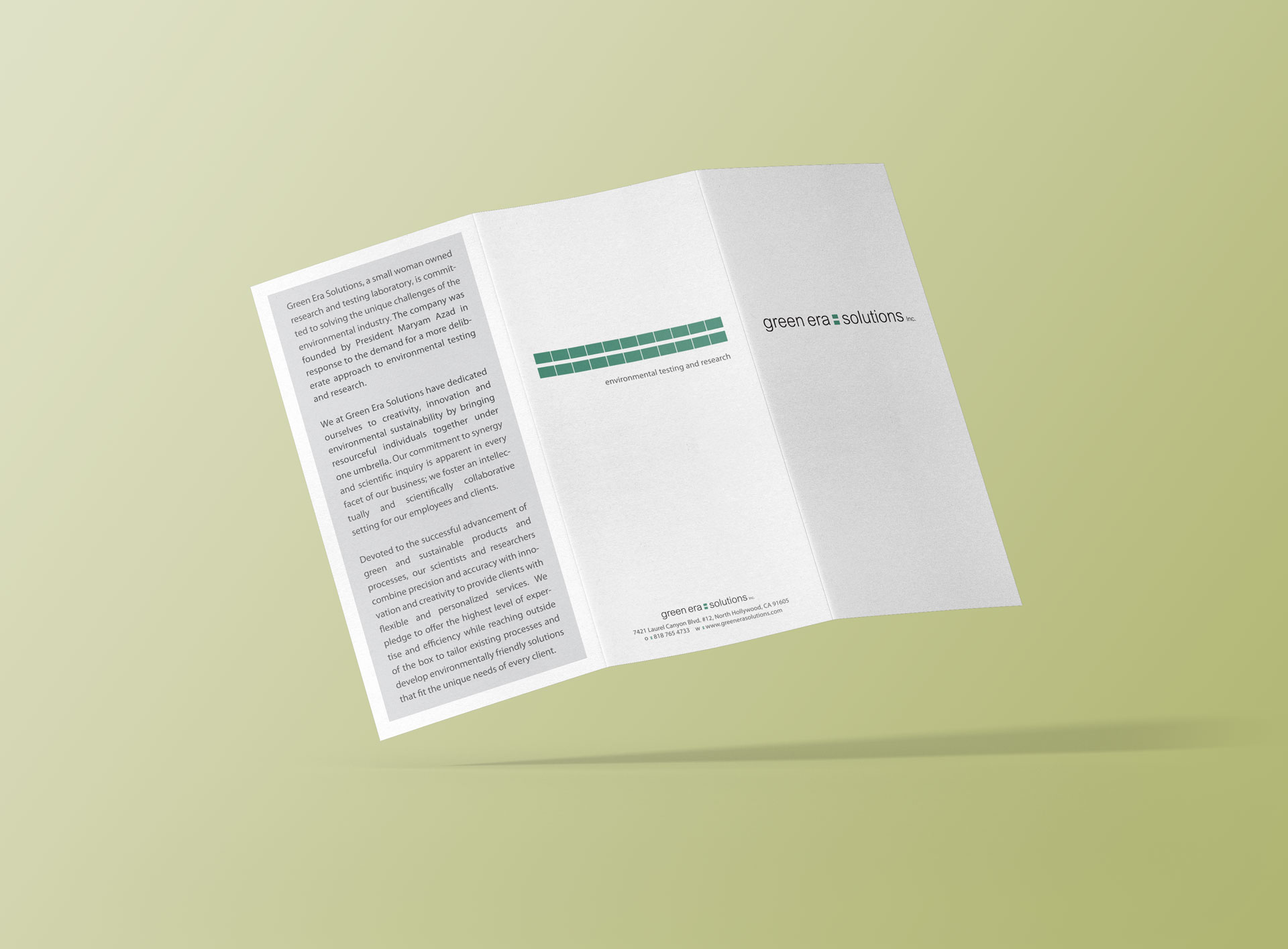
A chemical engineering company that specializes in clean, green energy needed a new fresh look. I wanted to make things as simple and clean as possible while still finding room for subtle cues in the design. The choice to go with all lowercase in the title was to disarm the audience and give it a grounded down to earth tone. The color selection was lengthy, I must have looked at more shades of green than I never knew imaginable. We settled on a hue that embodied a natural fresh feeling. Finally the inclusion of the graphic, a simple equals sign, brings the whole brand together. Green Era equals Solutions, now that’s a fresh idea.
Client:
Green Era Solutions Inc.
Type:
Sciences
Work:
Design