WJK Law
Is it me or do most lawyer’s websites look like they were either created in 1995? With William J. Kay, an independent lawyer developing his business, it was important that we approached the rebrand strategically to ensure that the firm differentiates itself from the competition while simultaneously creating a reliable image of a growing company.
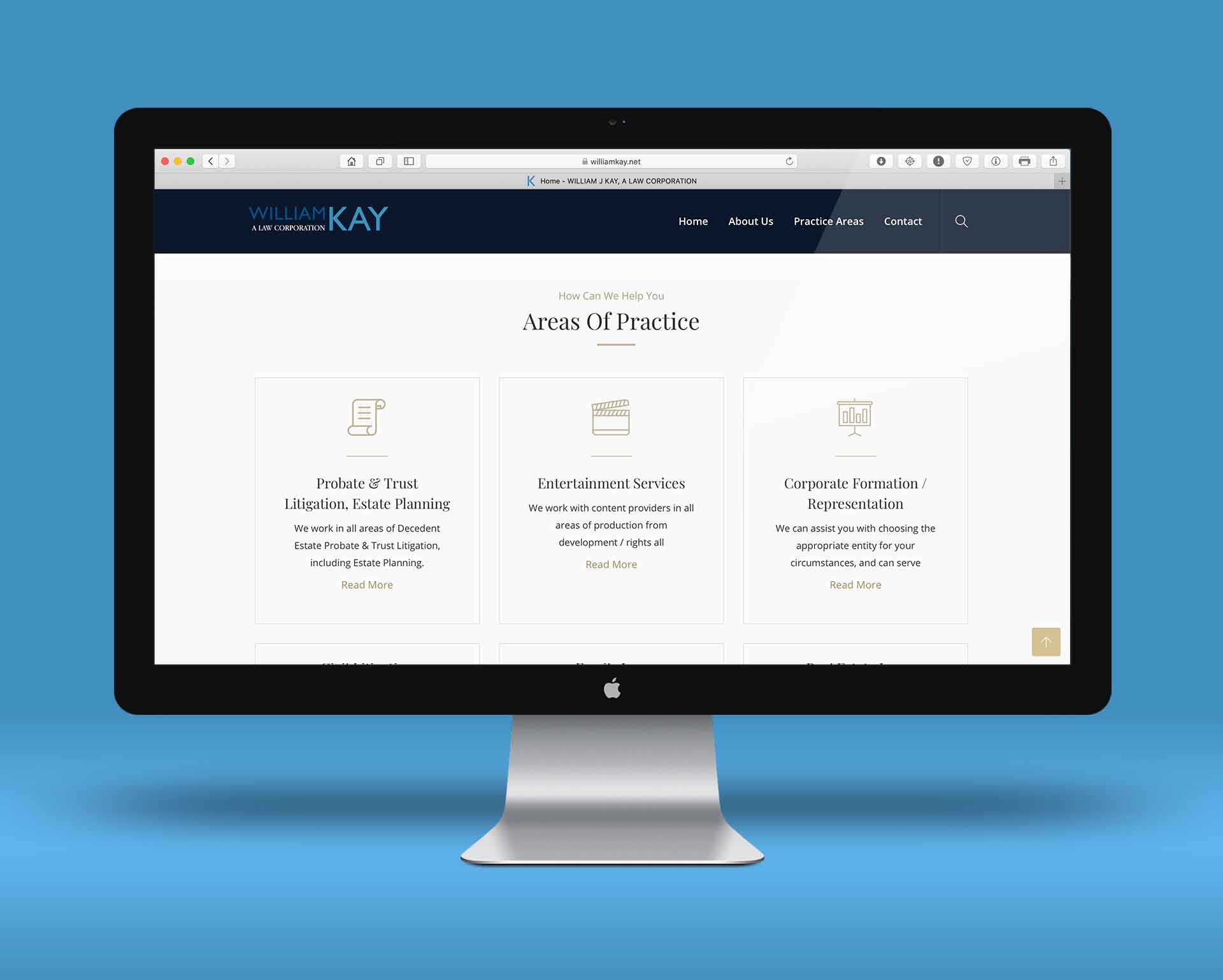
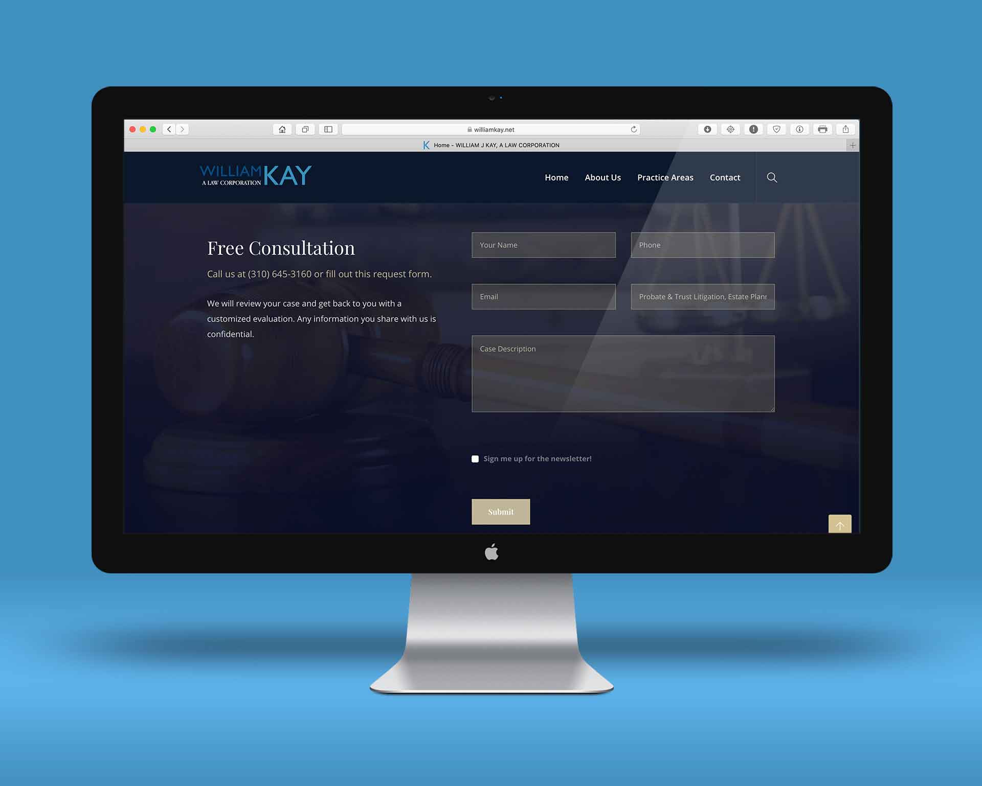
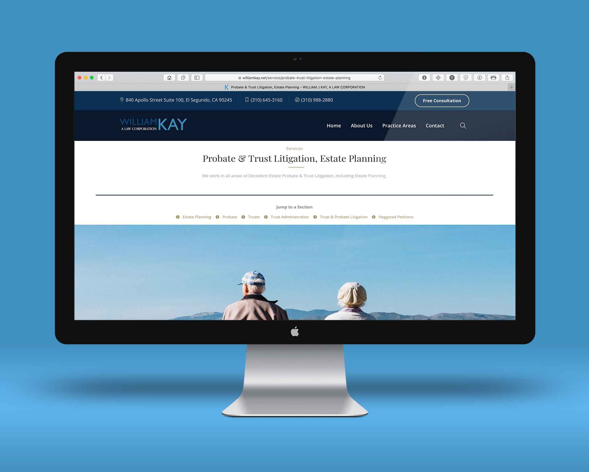
First phase of the rebrand was to develop a new logo and website. The new logo uses cool and bold shades of blue contrasted with a shades of grey and white for a crisp modern look while a warm golden hue is used as an accent throughout the designs to create a sense of familiarity and class. Familiar icons are used on the website to bring a bit of personality to normally mundane topics and creative photography is used to highlight themes without overwhelming.
Phase two called for an all out marketing assault, utilizing SEO, Google AdWords, Facebook Ads as well as targeted mail (electronic and standard). The design and message remain consistent throughout; modern, reliable and an expert in the field of Trusts / Estates and Entertainment Law.
Client:
William J. Kay, A Law Corporation
Type:
Legal
Work:
Design, Photography, Web
URL: